
The Problem
Older adults have trouble using technology such as modern smartphones and computers. This makes it difficult for family members to stay in contact and share moments of their lives.
Validating the Problem
My friend, Arwin, and I collaborated to make this happen. Together we ideated on the biggest problems we faced communicating with our loved ones, then we interviewed about the problems they faced. We interviewed our own family members as well as those of friends and their relatives to figure out the biggest problems we could solve in keeping families stay connected despite the technological gap.
Based on the problems we uncovered, I created a survey and sent it out via facebook groups around the country. This survey allowed us to quantify our assumptions and validate and invalidate them.
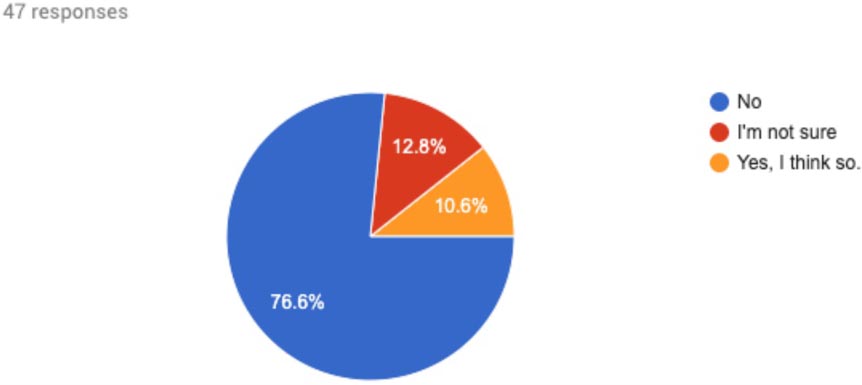
From the survey, we found that more than 75% of our college-aged respondents did not feel they interacted with their grandparents enough.
Do you feel you interact with your grandparents enough?
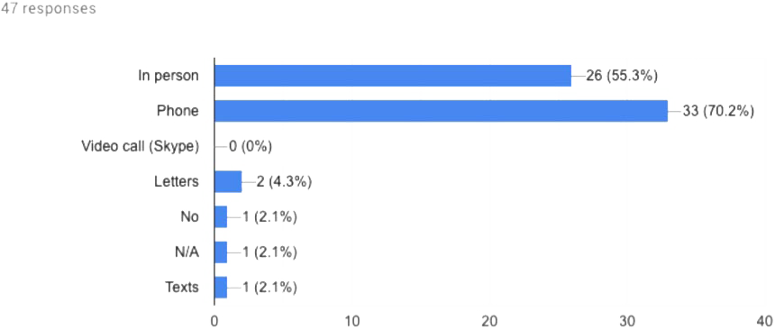
In addition to not feeling they interact with their grandparents enough, we found the only means they use to interact with their loved ones is in person or via phone. While a Gallup poll says college-aged people's primary means of communication is via text message.
How do you usually communicate with your grandparents?
This technology divide is what we set out to solve when starting this project, and the data we gathered validates this communication technology gap.
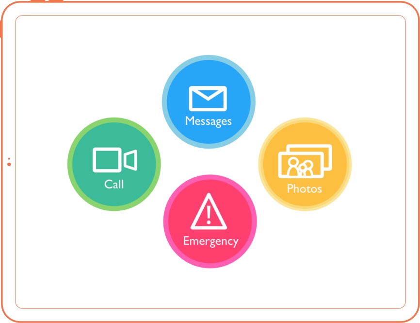
Feature set
Our main goal with this project was to help families communicate across the generations. But we also realized that so many of these startups coming up like Postmates, Uber, Handy, and so many others who solve mild inconveniences for younger more able-bodied individuals could actually be a game changer for the elderly.
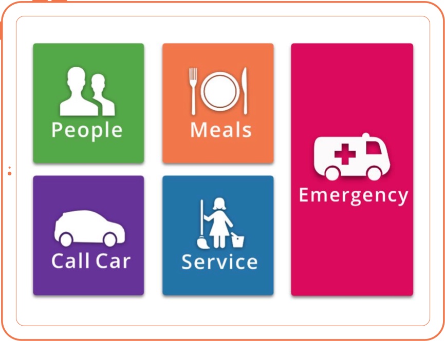
With that in mind, we came up with 4 areas of the app.
Each of these sections we felt met a clear problem area for our users.
We also decided to add in an emergency after hearing a similar story throughout our customer interviews phase. The user would tell us that their grandparents or parents were home alone when one of them had a serious health incident such as a fall, stroke, or heart attack and couldn't easily access a phone.
This common anecdote lead us to incorporate the large emergency button to make calling for emergency services as simple as two taps.
With these feature sets in mind, we created a mockup in Sketch and a prototype in Marvel that we used to test with our users.
User Testing with the prototype
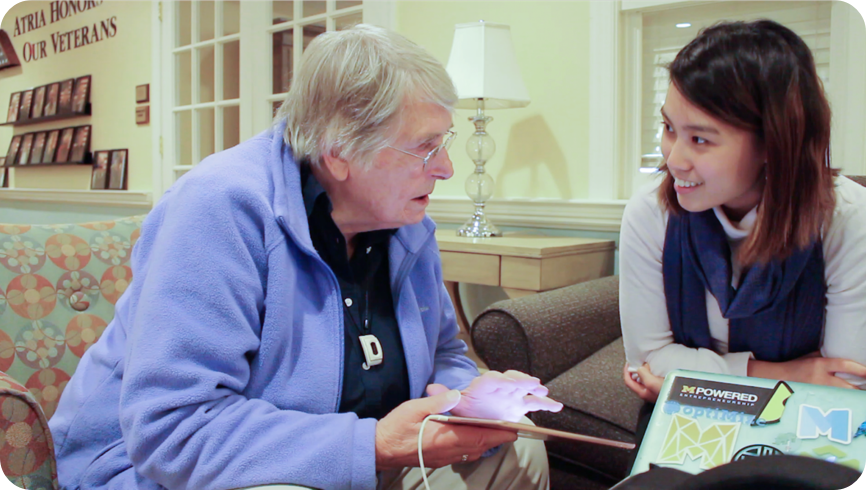
We user tested with adults 75 years and older with our Marvel prototype at first. We worked with Atria Park of Ann Arbor to find people to user test with.
Arwin crafted the usability testing document with all the questions and tasks we would run through with our users. With that all completed we went and started the process of testing and iterating.
After testing this with older adults we actually found they spent most of their time in the people section and weren’t too familiar with the other services such as Uber, Postmates, etc. So, we shifted the design away from what college kids wished their grandparents had to what older adults actually understood and used.
During this period we were conducting user testing every other week and iterating based on the feedback we received. Thanks to this rapid prototype testing we were able to hone down our design within a couple of months into something that users truly understood and could use.
Iterating, Iterating, Iterating
The next design was all about communication. From the initial round of testing at the Atria Nursing Home in Ann Arbor, we found that the elderly were most familiar with communication.
We expanded on the communication and cleaned up the UI so it would be easier to use. From this testing we learned a ton about how the elderly interacted with a physical capacitive touch screen.
Launch Design
Taking into account much of the feedback from our formal usability test, we created the design to the right. In it, you can see that the buttons use the same off-color border to make it clearer and the menu buttons larger.
The design to the right is the current developed product today. Development took about 3 months with a firebase backend and using Twilio for most of the communication handling. Unfortunately, we couldn’t implement the emergency calls due to legal limitation, but it is our top priority once we figure out the liability issues surrounding it.
Ohana won a grant from Michigan’s Optimize social impact fund. Thanks to that grant, Ohana is on the App store today and can be downloaded on your iPad by going to this link.
Unique considerations when designing for older adults
Often times the elderly are considered a somewhat homogenous group of “old people.” But the reality is they are as diverse as any other age group. They have those that are good with technology and those that are bad. Those with color blindness and those without. Those with poor eyesight and those with great eyesight. When designing for the elderly you are not designing for a prototypical old person but for maybe 20 or 30 different subgroups of people. This is how design has always been, especially when ensuring 508 compliance.
The main difference we learned is that those smaller subgroups, like users with motor control issues or memory loss, are far more prevalent in older demographics. This means we need to be even more mindful of something like understanding non-standard button presses and labeling our buttons. But we also have to design for older adults who are tech wizards and can breeze through this app with no problem, that means incorporating both advanced and low tech solutions in the product such as swipe to go through photos as well as next arrows.
Another interesting observation was that as technology advances and designers are designing for users who are already familiar with their design patterns, it because even more difficult for an older user to start using technology.
Take the iPhone 3g design with a big clear end call button vs. the current end call button.
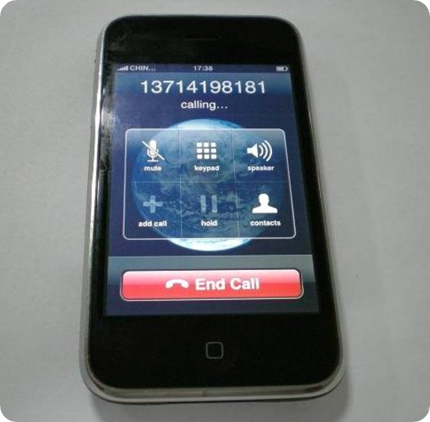
With every tech generation, the step up to enter the world of technology gets higher and higher. This experience reminds me of designing an app for illiterate users in India. Users as young as their late twenties would refuse to test our app because they did not know how to use a smartphone and did not want to fail and look dumb in front of their peers.