Expedia
At Expedia, my team and I made a revolutionary new travel booking iOS app.
The Requirements
It all started with the requirements our business stakeholders
They gave us this table to help us describe what we needed to make.
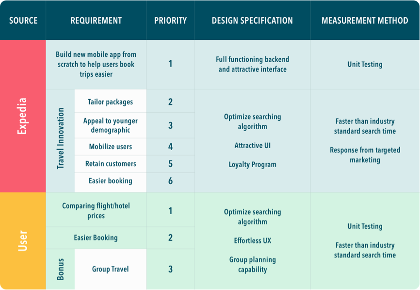
Three main goals.


Over the course of the next year we built an app to make this possible.
Research
The first step was understanding our users. Expedia wanted our app to focus on college students. Being in Ann Arbor, the heart of the University of Michigan we immediately began interviewing students around campus.
Each team member interviewed 5 people and asked a standardized set of 16 questions as part of the interviews.
The main takeaways from those user interviews of 18 - 28 year olds were:
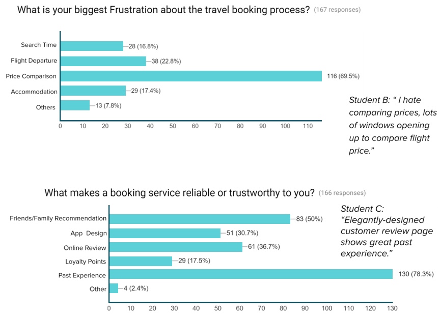
These responses weren’t surprising especially for a very price sensitive group, but what was particularly interesting was learning how many sites users will open at the same time to compare. For instance, many users cited Kayak as one of their go-to sites to start their travel search since it allows them to simultaneously search multiple other travel sites at the same time.
After honing in on some of the major problem areas our users were facing we crafted a survey we could disseminate to hundreds of people in order to understand the broader trends in travel for college-aged users.
Over 200 people answered our survey.
As a result of the survey, we found three main problems we could focus on.
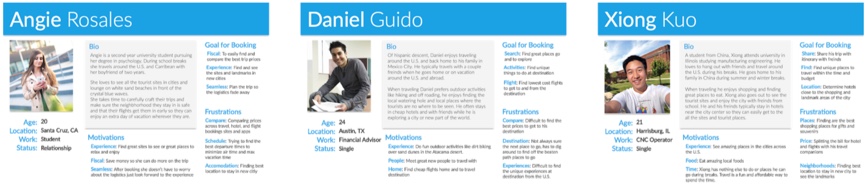
Now that we were able to uncover our user's main pain points our, UX researcher made personas based on these results. Meanwhile, I downloaded and tested nearly 20 travel apps to see how they each addressed these frustrations (this was back in 2016, RIP Stayful)

As a result of the competitive analysis, we noticed a couple of major gaps we wanted to address.
We worked with our Expedia stakeholders by giving them a detailed presentation of our findings.
After getting approval from the product and design leads we moved on to finalize our user personas based on the users we interviewed and surveyed.
Product
Now that we know the users we’re designing for and the business requirements, it was time for the long walks full of thought on what the thesis of this product would be.
In my mind, every product has some central idea behind it that justifies its existence. For many travel apps I'd used the central thesis is often pretty simple. For Hopper, the thesis was using machine learning can accurately predict when is the best time to buy flight tickets. Their massive success in implementing the product around that thesis demonstrates customers agree.
For HotelTonight, the thesis is hotels are willing to give massive discounts to last minute guests.
So, what would the central thesis of our app be?
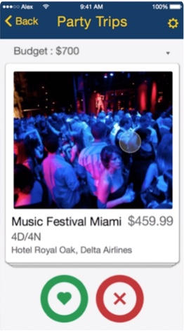
Initially, my app thesis was users want to browse available trips so if they see something they like they can just go.
But, as the rest of this write up will explain. That initial thesis was flawed. People are not always looking for deals and Expedia was not the only company making bundles.
Eventually after lots of time and user testing, the thesis got distilled into: customers want travel itineraries uniquely tailored to them and to get alerted when those itineraries are on sale.
With this thesis iterated into being, the product became all about making the best possible tailored packages. From design to engineering every aspect of this product was to help the user see the packages they created for them.
Design
With our personas and thesis finalized we began to mockup the user flow of the app and how it might look.
For the main flow of the app, we decided we really wanted users to browse and come back to the app when they’re thinking about traveling.
During our research we found that nearly half of all travelers are looking at trips even when they don’t have an intent to book, so browsing and seeing what experiences are available was a must.
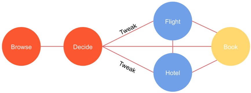
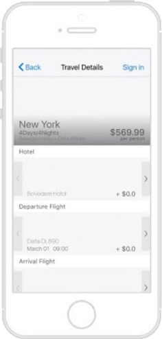
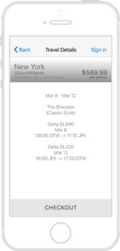
After a user clicked on a package, they should be able to tweak it. Whether that means changing the flight or the hotel, it should be something they can change so we don’t lose a conversion because a user prefers to accumulate more airline miles, for instance.
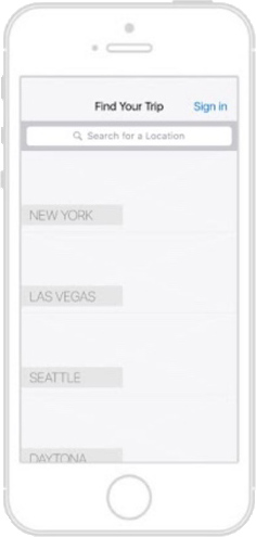
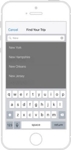
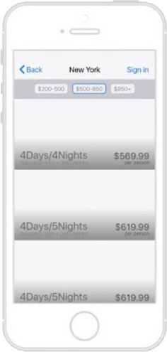
With the main information architecture planned out by our UX designer, Varun, we began working on how the app might actually look. We started with a pretty vanilla wireframe to help us plan out the actual user flow.
After the initial wireframe, we got a bit more creative with how the user could browser packages.
As well as about 6 other designs over the course of 2 months.
As we were working on the UI / UX ideas and feature set we began seeing the trouble with comparing across many different platforms. Since we were doing bundles it would be hard to compare our bundle prices with other platforms unless we broke them up and remade them on other Expedia owned websites like Travelocity or Hotels.com.
In addition to this concern from the product side, the developers began working with Expedia’s packages API and realized that the special deals can expire as quickly as 20 minutes. A 20 minute expiration time means it would be difficult for our users to compare that deal and return before the time expired.
With these concerns in mind, we started looking towards older demographics to see if they were as concerned about price. We specifically surveyed Expedia employees in the second round both because they are older than college students and, because we are officially an internal Expedia Labs project, Expedia employees would realistically be our main users.
The results of the survey were again that price is important, but of the 69 Expedia Employee responses to that question, only 39% said the price was the most important while 32% said destination and 16% said travel time.
These results indicated that the older users were not quite as concerned about price, although it wasn’t until after user testing with our target demographic did we realized what the implication of those results.
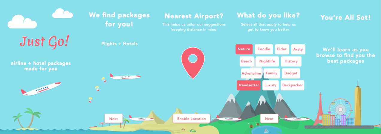
After another 2 months of iterating and testing, we finally landed on our final design.
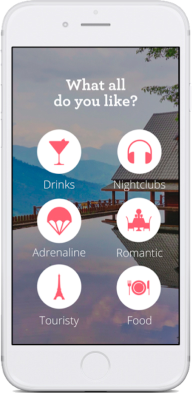
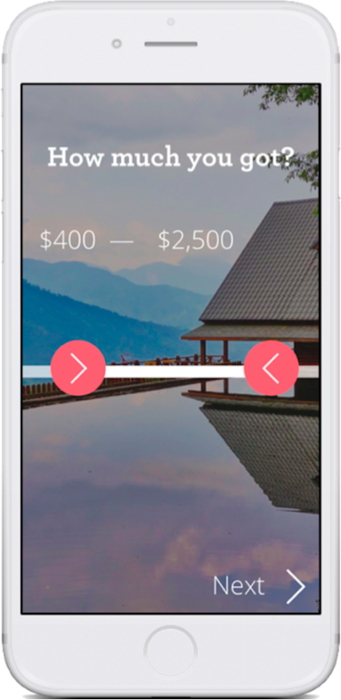
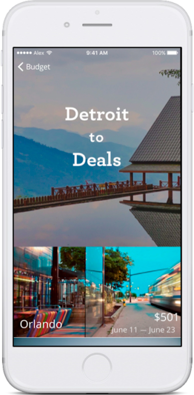
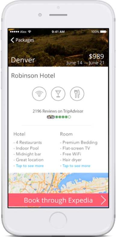
We tested paper prototypes with users and honed the product down to its essence: what you like and the travel packages.
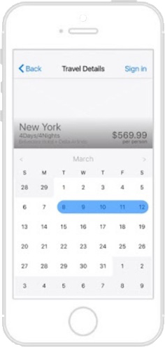
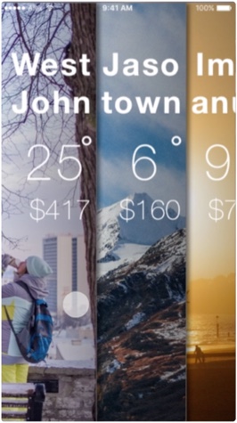
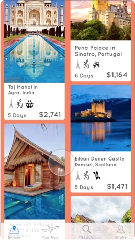
After the onboarding screens, there were just two main screens in the app the browse screen and the package detail screen.
At this point, we discussed the design and felt we needed to think about branding this app more. Because it was an Expedia labs project we didn’t need to abide by the Expedia branding and could be more free with what design we went with.
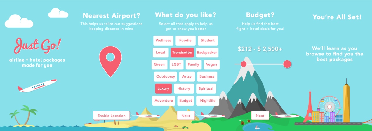
Brand
When all apps and products look the same, strong and clear branding can differentiate a product in the market.
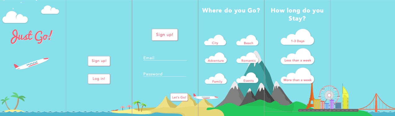
I had been experimenting with a few different fun illustrations as a result of a separate client branding project I was doing and decided to take a stab at branding, designing, and illustrating the app.
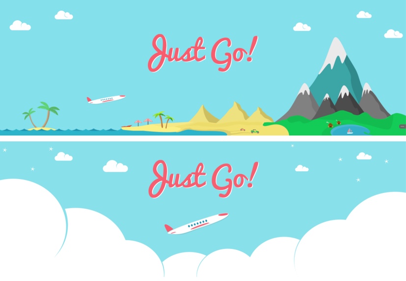
We decided to call it Just Go! In reference to the nearly instantaneous package availability and ease of choosing a trip you would love.


For the theme, we wanted to highlight the different experiences our trips could give you. Whether it's kayaking in the ocean, riding dune buggies in the desert, staying in a cabin on a lake, or exploring a new city.
The color followed the theme of a world of possibilities. Blue represents beautiful days and clear skies. While the soft red contrasts the rest of the calm design to provide a bit of urgency since our packages have a 20-minute lifespan a user needs to book soon or lose the deal.
Illustrations are an important part of how we decided to brand the app since they weren’t so common in app designs back then. Of all the apps we tested only Hipmunk and Hopper used illustrations. We felt the illustrations made the apps feel more fun like travel planning should be instead of the chore it turns out to be.
During this whole app design process, we found from our users again and again that booking trips is hard. Whether it’s the price, what to do, where to go, or coordinating with a large group of people, the actual trip booking process is awful.
Adding some fun illustrations to help put a smile on a user’s face felt like a worthwhile delighter we could easily add to the product.
Development
We officially began development in May 2016 with the goal of having a completed MVP app by August 19th.
Because we were creating an MVP, we had to make some tough decisions on what features to cut.
The main features for the MVP implementation
We chose to limit these features so our data scientist, backend, and frontend developers could craft an exceptionally focused product first, before moving on to the quality of life features.
Because we were making recommendations, limiting ourselves to 10 cities and 1500 hotels ensured we could maintain smaller datasets meaning faster model creation and faster iteration.
On the backend side, it meant when we used a multi-threaded crawler to cache all of Expedia’s packages for 10 cities every 2 minutes we used a lot less AWS resources.
Limiting the scope of the MVP is what allowed us to move fast and craft a focused initial experience.
Recommendations
Hao and I worked on the recommendation algorithm. We used Gogobot’s trip recommendation data via a data sharing agreement between Gogobot and Expedia.
Thanks to that dataset we got hotel type classifications for each of the hotels we could make packages with. These hotel types would be something like trendy, luxury, outdoorsy, affordable, etc. based on the type of traveler we had we could equate the hotel type to that person.
For airlines, we didn’t have a dataset like this, but there are far fewer airlines so the team all categorized the airlines ourselves based on a relevant subset of our classifications. Airlines like Spirit and Frontier were tagged for the budget traveler while Virgin andDelta would be more on the luxury side.
The thing about many of the tags we chose is that some cancel each other out. That means each tag needs to be weighted since some people love luxury but are also like to save money budget. If they choose both, which wins out? Neither has to win out completely. When we curate the list of packages we put more budget options in with the luxury, but if the user selects more luxury options than the budget the luxury tag will gain more weight for that user as we gain more data from them.
The initial onboarding tags give us a baseline point to start learning about the user, but the more they tap on packages in the app the more we learn. In the browse view we also put in the occassional "not indicated" tag, so if the user never said backpacker, we would put a backpacker tagged package in there, so the user has an opportunity to change their preferences organically without them even realizing it.

In addition to the types of airlines and hotels, there was the problem of time. How do you give reasonable dates to people when you do not know their schedule? For instance, students have to plan around the school year but are free during summer, winter, and spring breaks. Families also have to deal with the school year while single people are much more flexible.
To get around this problem we added a kid's criteria in the filter screen. If a family chose to add kids, then we would take school year breaks into account. Otherwise, we would rely on weekends for short trips and a full week for longer trips. Trip time we found during our survey was one of the most important factors. Because of trip time, you’re not going to go from New York to Hawaii for a weekend. You’d go for at least 5 days. That means all trips where the flight was more than 4 hours would be 4 - 8-day trips with the length also depending on a user’s budget. A trip with a flight time of 2 - 4 hours was at least 3-day trips and flight time under 2 hours could be done on a weekend, like going from Detroit to DC. This way the trip dates were already planned around a user’s weekends and realistic time for a trip based on how far away it was.
On the backend, our recommendation algorithm was running a random forest user classification which allowed us to make clusters of similar users. Each cluster of similar users would train the model on what that group preferred and allow us to give everyone in that group better recommendations even if there were only a few people in that group actively using the app. This meant we could give better recommendations to all similar users regardless of how much they used the app.
Hao and I worked to refine and test the algorithm until we were able to get 82% cold start accuracy in user testing. That means just based on an initial user’s preference selection in onboarding, 82% of the packages they saw were something they were actually interested in.
Iterate, Iterate, Iterate
We were on a two-week release cycle. That meant after the initial implementation was done around late June, Varun and I would have a ship ready product every 2 weeks. We scheduled formal usability tests and tested the app with our users.
We conducted these tests every other Friday for 2 months. As a result of these tests, we gained a vital insight that caused us to pivot. College students do not want to use this app because they cannot easily price compare. Since the packages are combined flight and hotel, the user needs to search for both at the same time across many platforms. By the time they have compared the package and returned to the app, the travel package has expired.
During our user testing, we actually found that our most receptive users were parents in their mid to late 30’s and forties with young kids. They didn’t want to deal with all the hassles of booking a trip and were not nearly as price sensitive as college students. They loved that the app chose everything for them and all they had to do was pick among things they already liked.
After finding out parents were our actual user group, we added features like adding children to your trip in the filters section.

Of course, the more we tested the more we learned. We found our onboarding was not clear to our users, so we worked to make it clearer.
Launch
As our August due date arrived we were in great shape. The product was ready and we demoed it to the rest of the Expedia team, we even got to demo it to Expedia’s CEO, Dara Khosrowshahi.
It was released internally as part of Expedia Labs and its innovations in package caching and user preferences can be found throughout Expedia’s website, app, and ecosystem now.